BRANDING & DESIGN
Mrs Dowsons is a family farm attraction in Lancashire, who initially contacted us to redesign their tourism leaflet. After digging a little deeper we advised that in order to be perceived as a high quality attraction that stands out from other local farm-based days out in the area, a renewed look and feel for their logo and brand identity would be the most effective course of action.
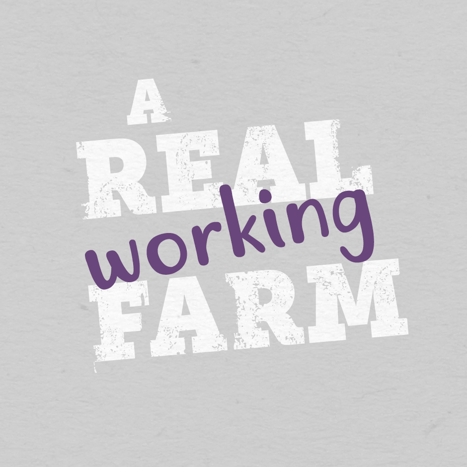
From first hand experience, we discovered that a day at Mrs Dowsons is truly hands-on… ‘A real working farm’ where families can experience an authentic day-in-the-life of a farmer. To communicate this in the most appropriate way for the audience, we focused on ‘the senses’, using playful typography and developing a bright new colour palette to evoke the sights, sounds, textures and tastes you would experience at a working farm. The rebrand also included the transformation of the logo into a more modern and useable graphic form.
Our honest approach to working with Mrs Dowsons allowed us to bring the unique visitor experience to life through their creative communications, raising awareness of the attraction to potential visitors who may not have been aware of the farm park previously and changing of perceptions of the visitor experience, contributing to a massive 25% increase in visitors.
Capabilities
Brand Identity
Logo Design
Leaflet Design
Copywriting


Based on visitor numbers for 2018 season