Client.

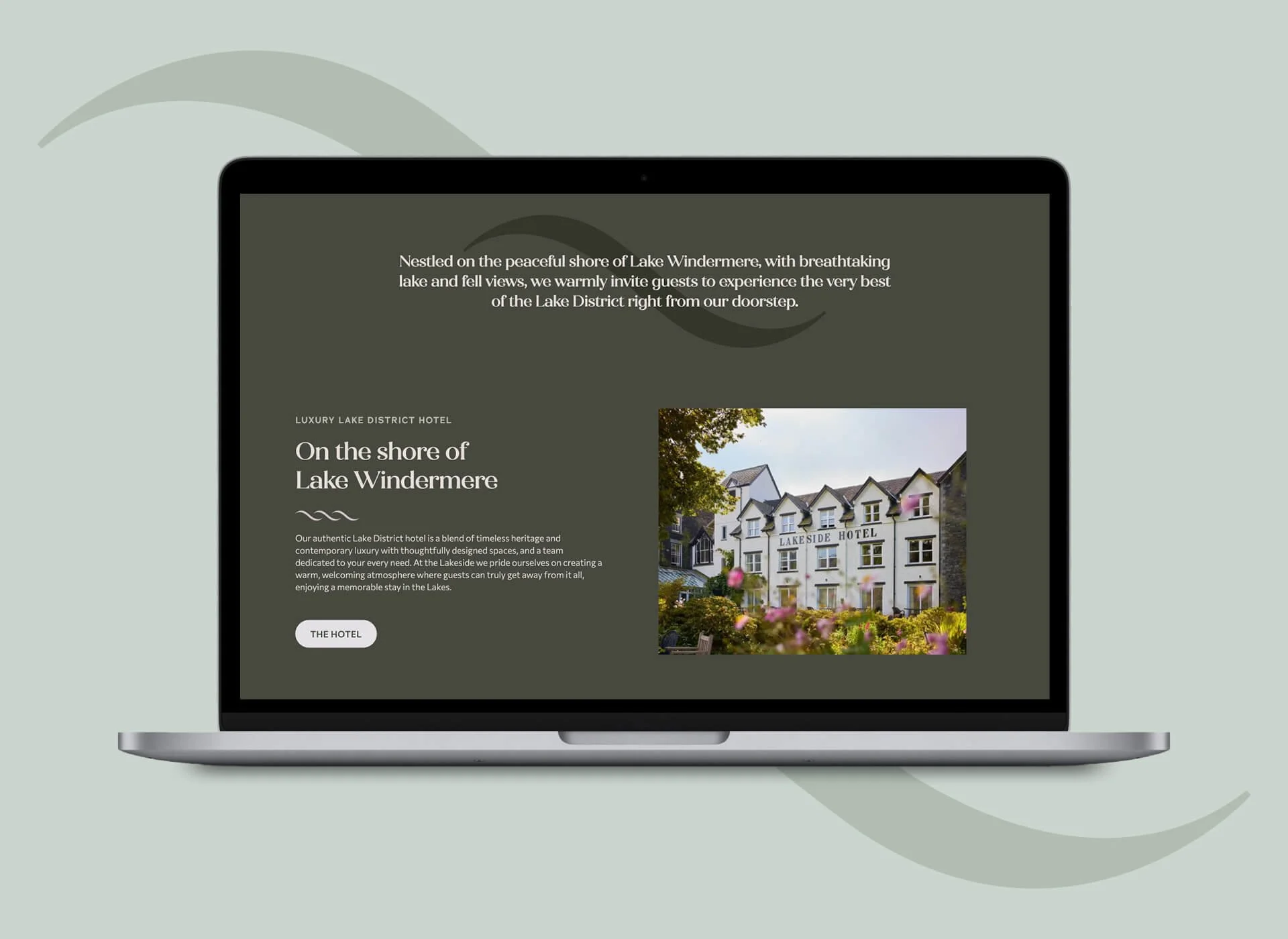
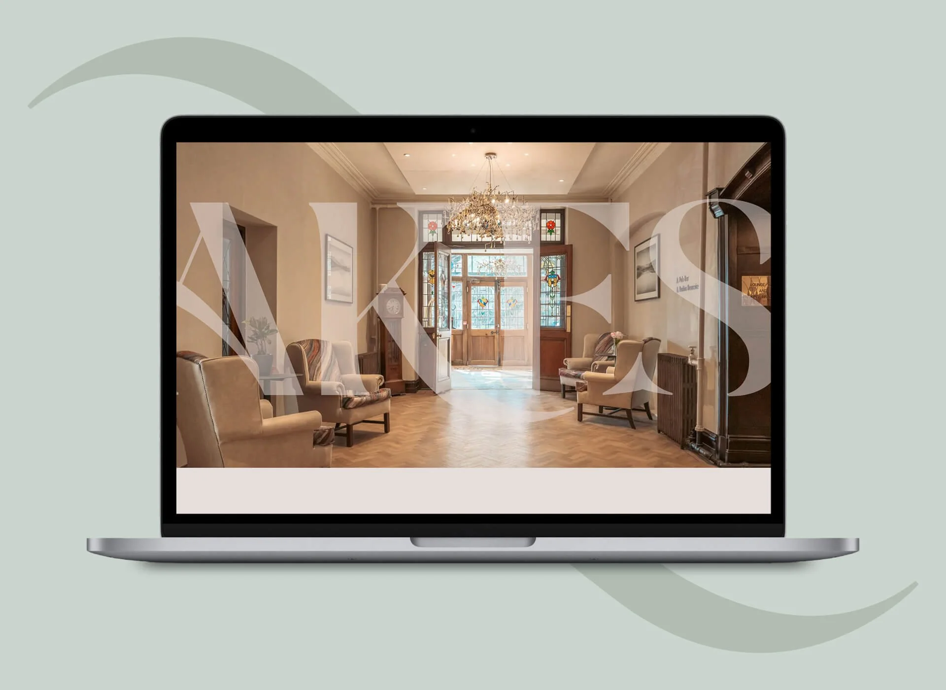
Lakeside Hotel, part of the Classic Lodges group, is a traditional, luxury Lake District hotel perfectly positioned on the shore of Lake Windermere, boasting stunning lake and fell views.

Brief.

Having recently acquired the hotel, Classic Lodges approached us to make recommendations on the hotel branding. We found the existing brand to be disjointed, inconsistent and with no clear vision.

Strategy.

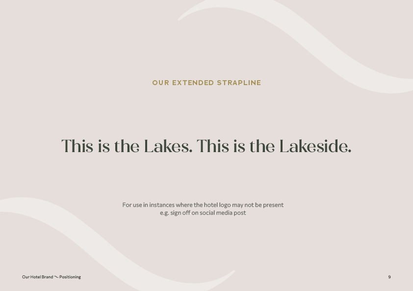
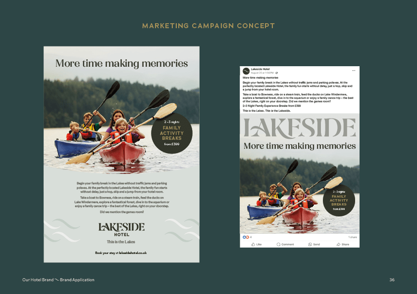
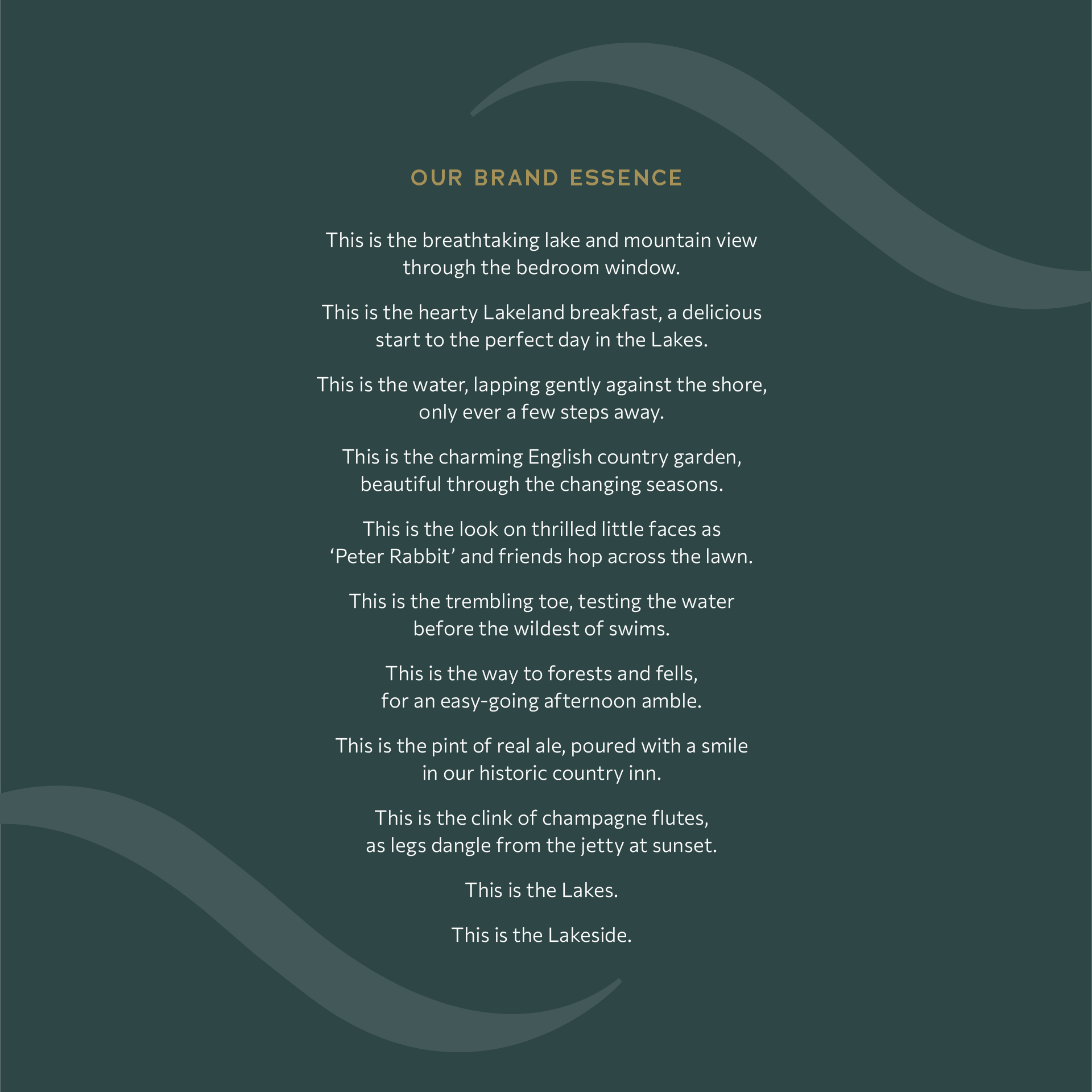
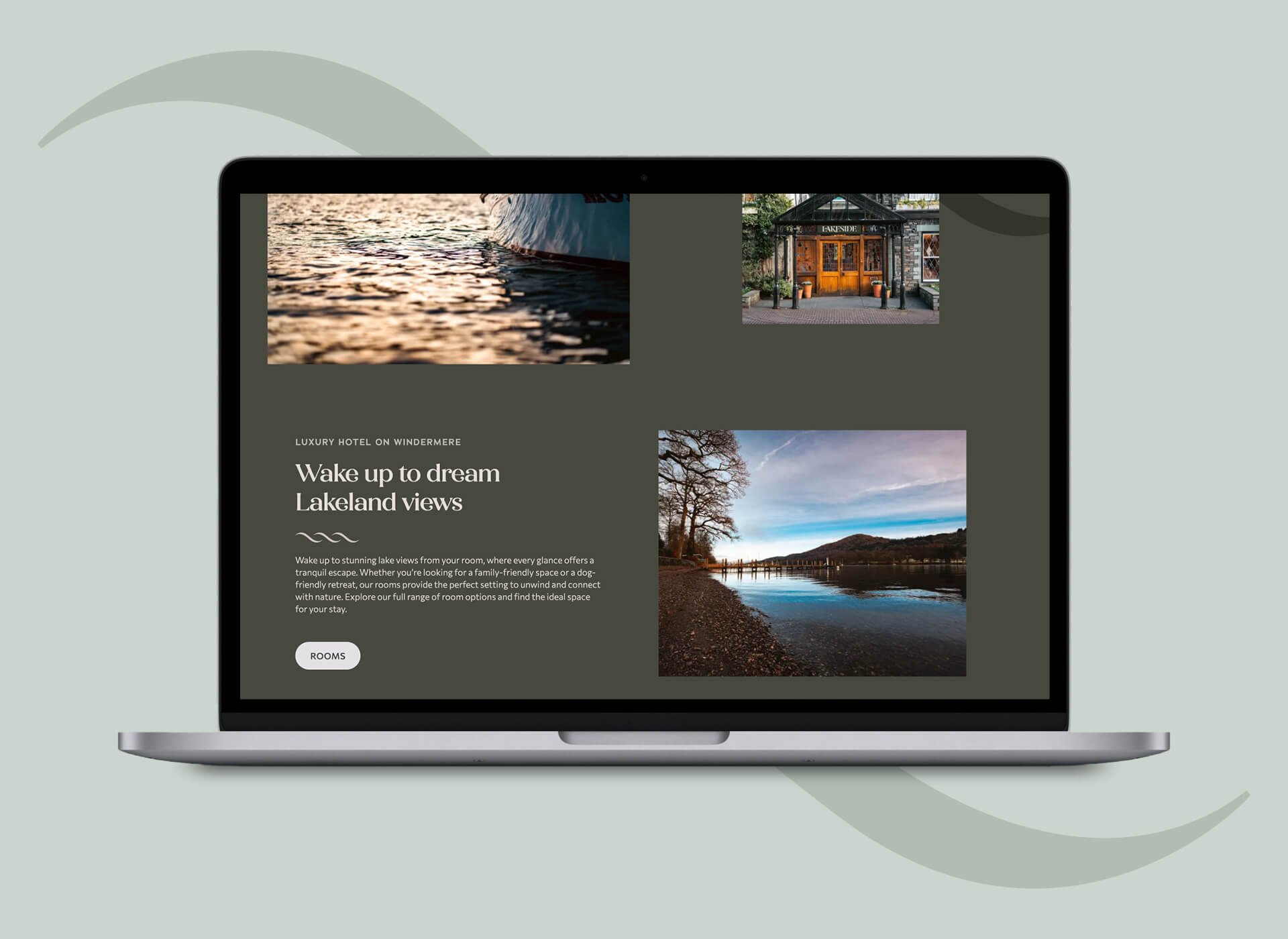
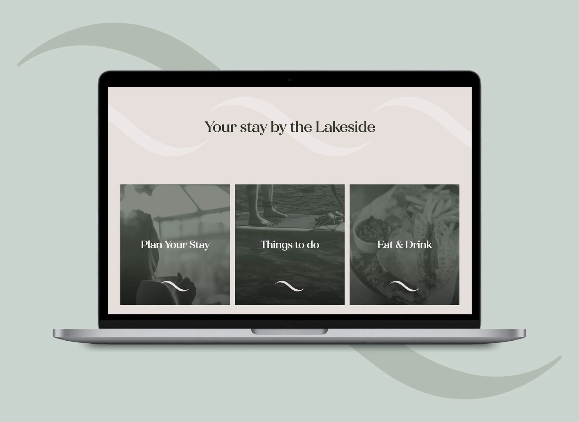
Following in-depth research, we established that, from views and activities to food and gardens, the hotel offers guests everything they need to enjoy the full Lakes experience. As such, we repositioned the hotel as ‘The Quintessential Lake District Hotel’.

Delivery.

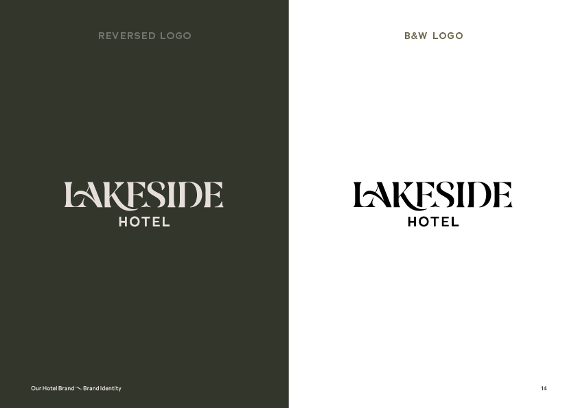
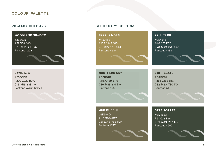
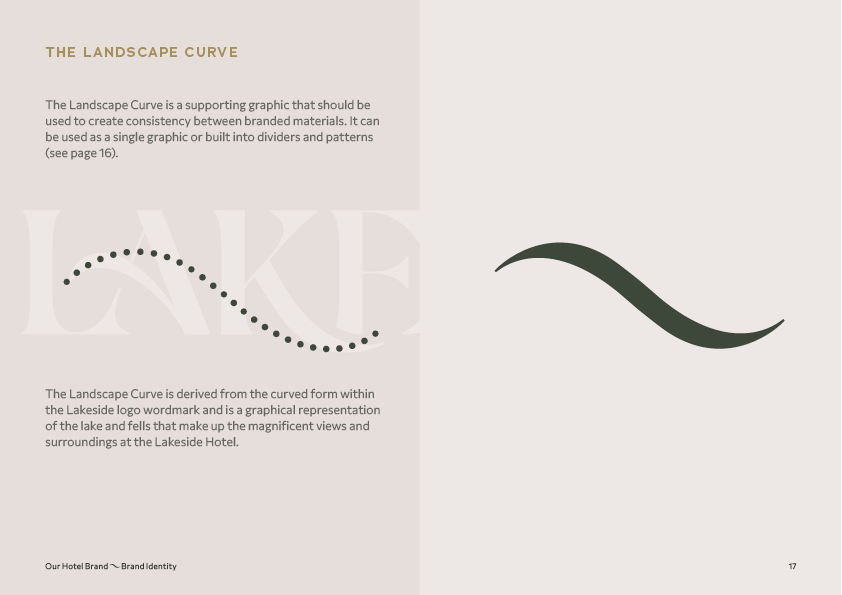
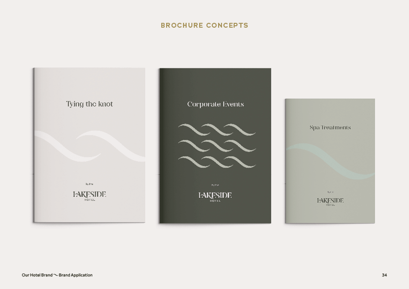
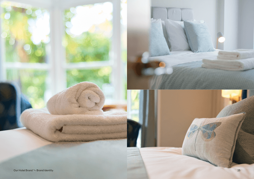
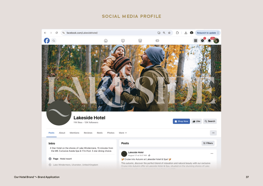
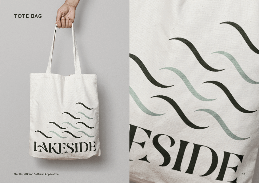
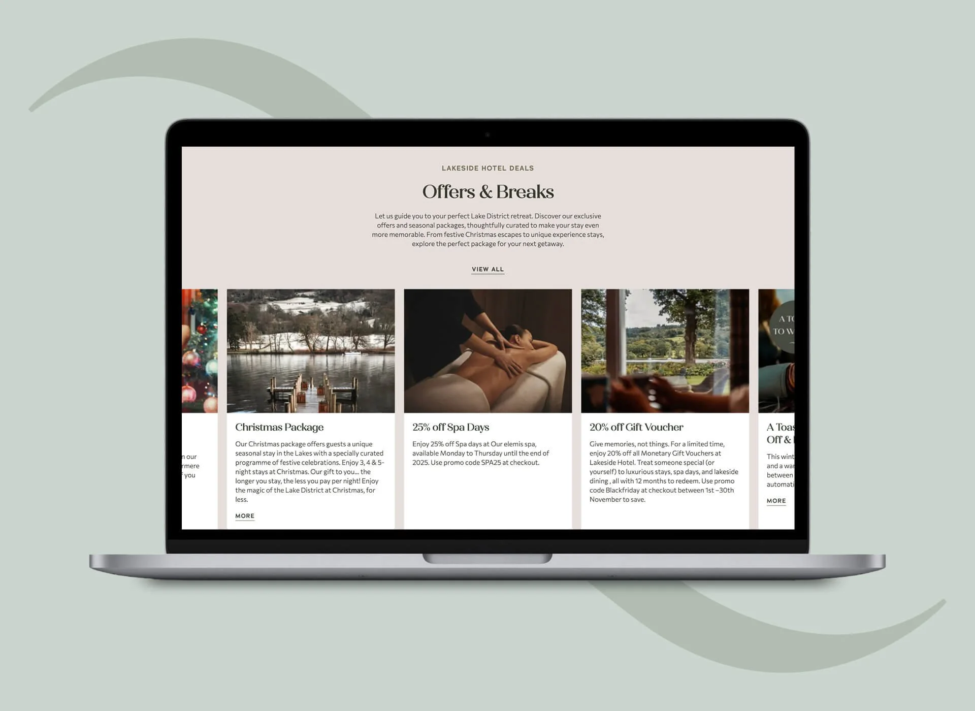
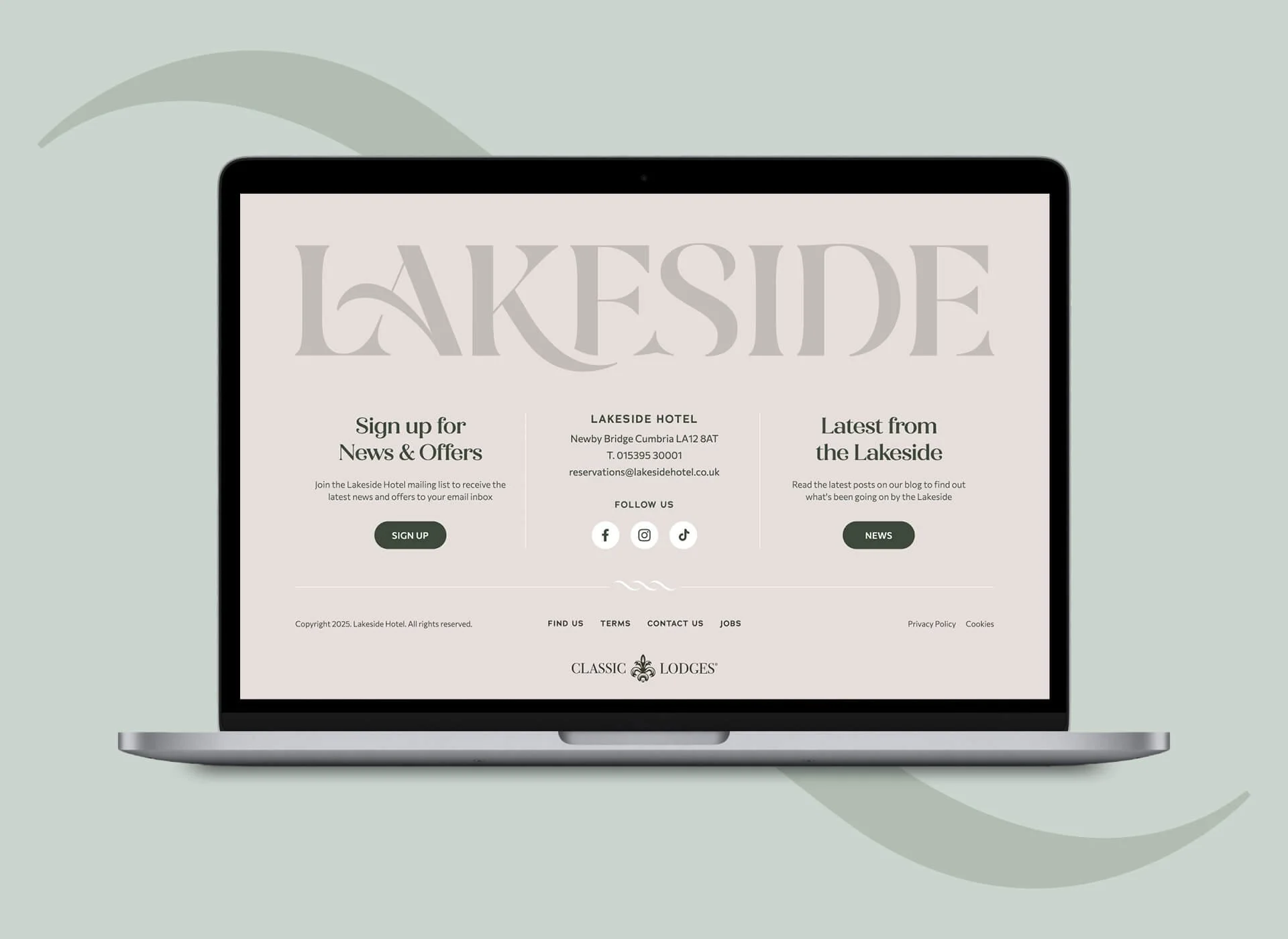
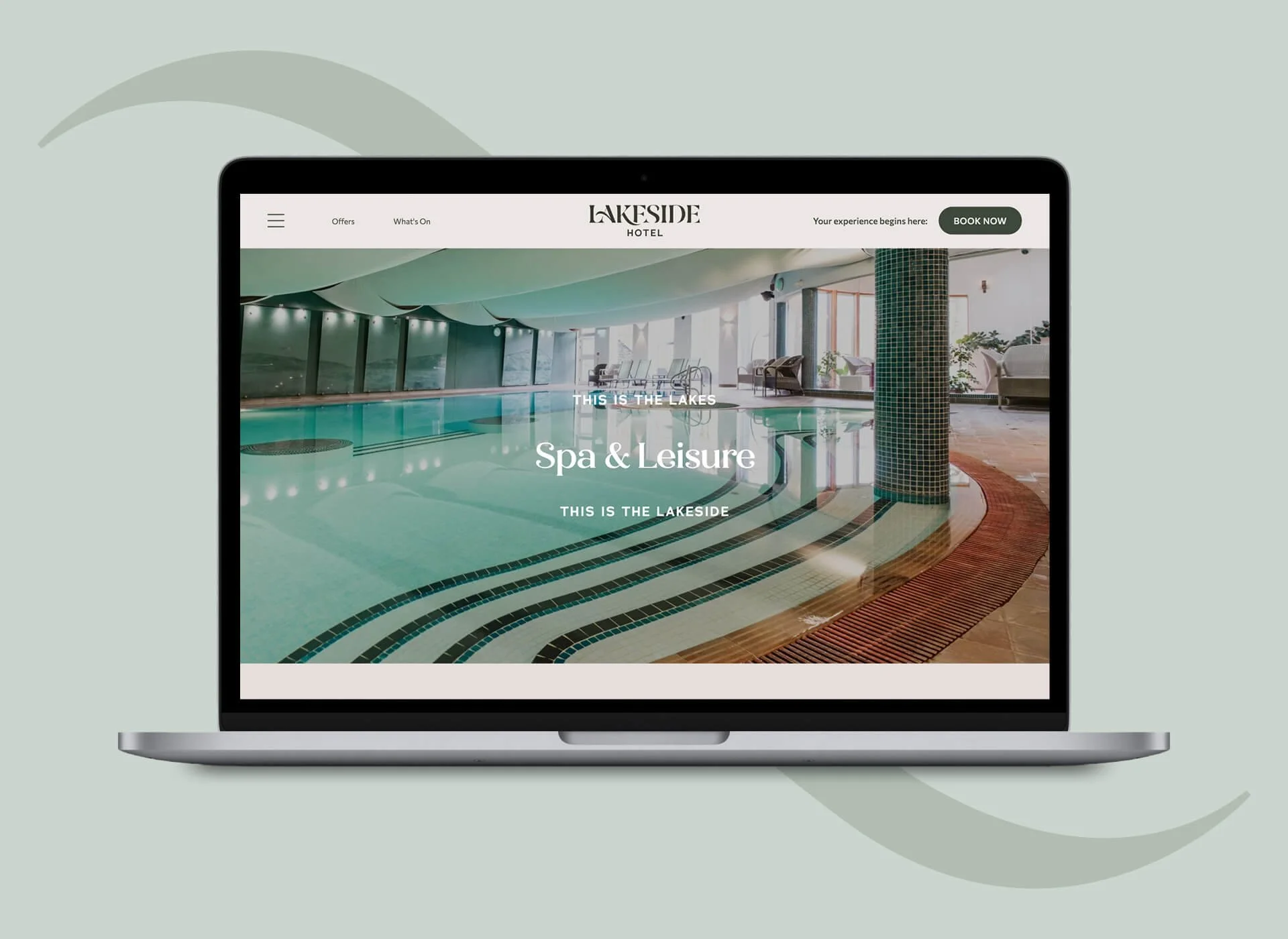
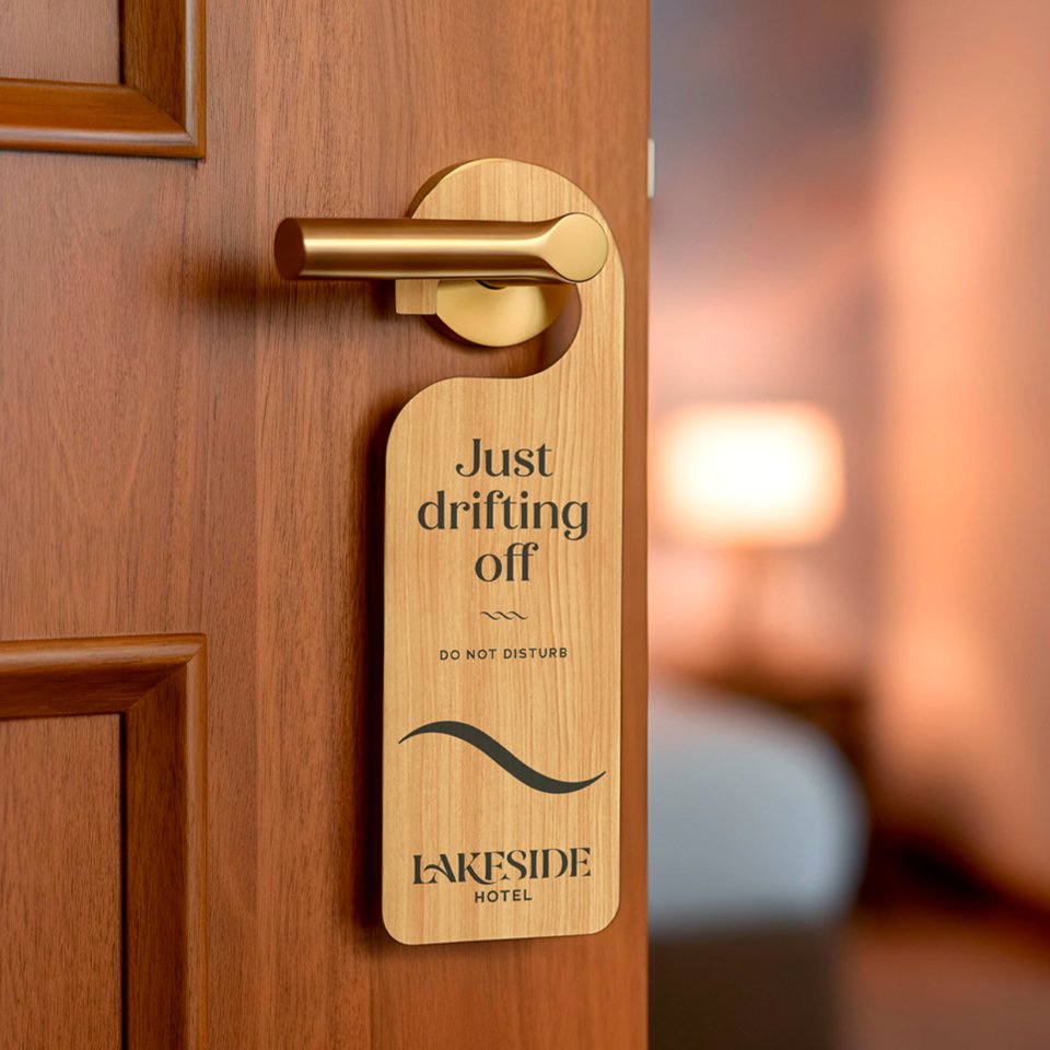
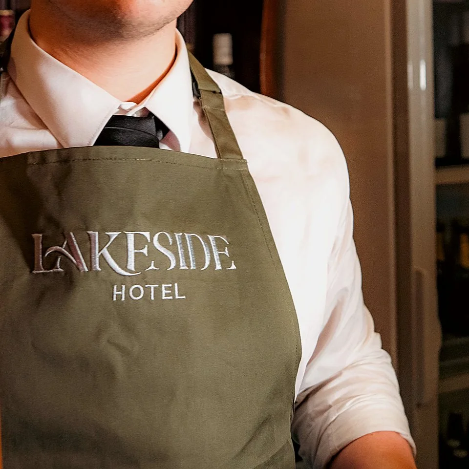
With brand strategy in place, we designed a complete new visual identity for the hotel, with an attractive logo and complementary curve pattern, inspired by the lake and views. We also designed the new website, signage, menus, door hangers, uniforms and more.
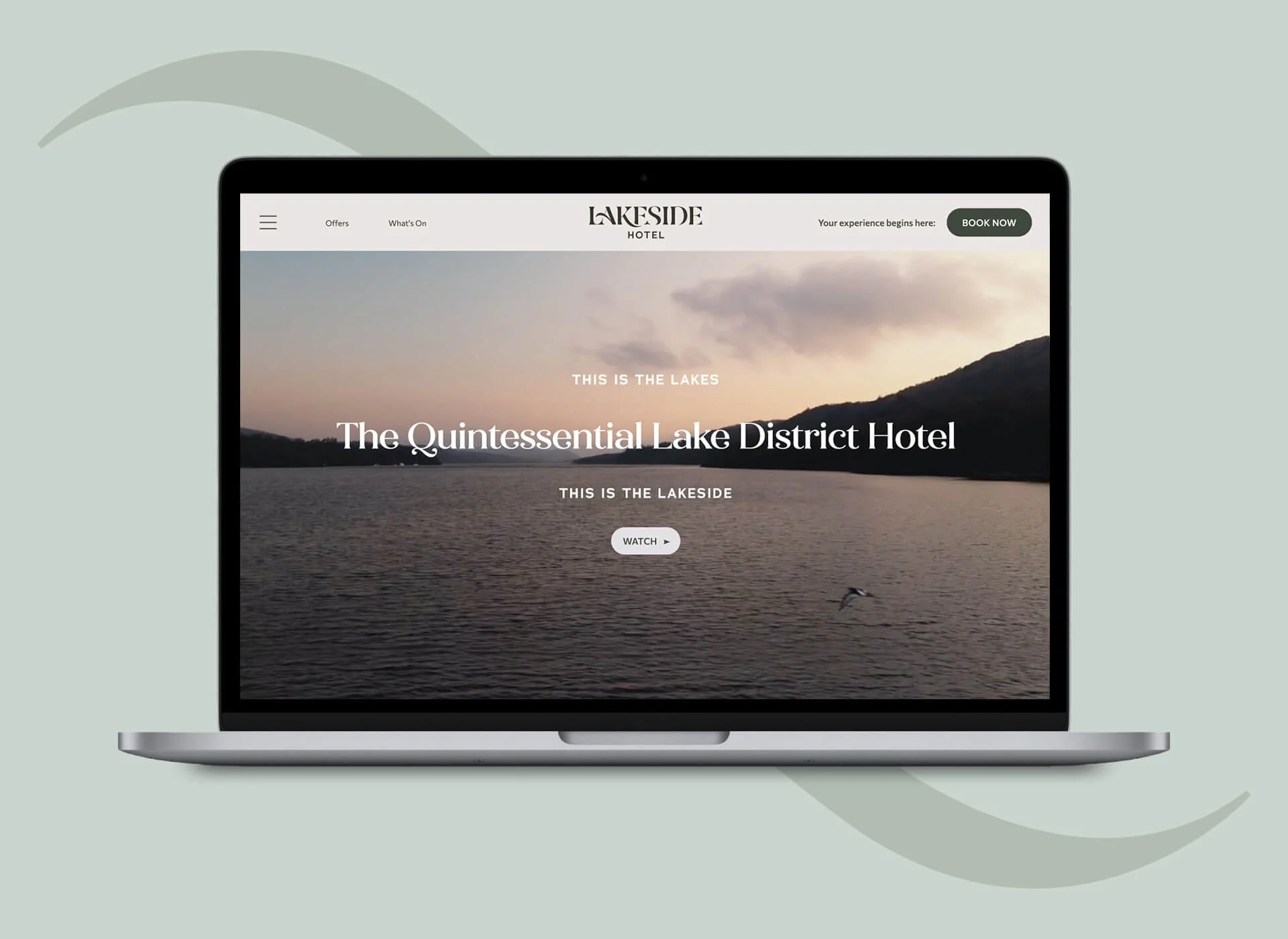
lakesidehotel.co.uk

Text reads 'The Quintessential Lake District Hotel' on a black background.
Lakeside Hotel and Spa logo before and after. The before logo has flying ducks and text. The after logo has a curved typeface and is dark green colour.
Cover of Brand Guidelines document with the title 'Our Hotel Brand' and the name 'Lakeside Hotel' on a dark green background.
A presentation slide with beige background and abstract curved lines. The slide has the title 'This is the Lakes. This is the Lakeside.' It also includes a note about use when the hotel logo may not be present, and the bottom left corner indicates 'Our Hotel Brand ~ Positioning'.
Comparison of the Lakeside Hotel logo in reversed colors on the left and black-and-white on the right.
Color palette chart displaying primary and secondary colors with their hex codes and Pantone colors. Primary colors include Woodland Shadow and Dawn Mist. Secondary colors include Pebble Moss, Fell Tarn, Northern Sky, Soft Slate, Mud Puddle, and Deep Forest.
Page from a branding or design presentation with typography samples, including headlines, titles, and body copy. The main headline reads 'Your Lakes experience begins' in large, bold font. The page features different fonts, font sizes, and layouts for various text elements.
Page from hotel brochure or website with descriptions of lakeside experiences, including keywords such as warm, friendly, authentic, helpful, informative, passionate, personal, emotive, captivating.
Graphic illustrating a curved, dotted line labeled 'The Landscape Curve' and a solid, curved line representing the shape of a lake.
Three brochure covers for Lakeside Hotel, titled 'Tying the knot,' 'Corporate Events,' and 'Spa Treatments,' displayed on a light background.
Collage of three hotel rooms featuring neatly made beds with linens, pillows, and towels, with large windows letting in natural light.
Facebook social media profile page for Lakeside Hotel showing a photo of a family outdoors in autumn, smiling and enjoying a moment together.
Poster advertising a family activity at Lakeside Hotel featuring a photo of children kayaking on a lake with a scenic background and text promoting making memories and family activity breaks.
White tote bag with abstract wave design and the word "LAKESIDE" printed on it.
Door handle with a wooden sign hanging from it that says "Just drifting off" and "Do not disturb" at Lakeside Hotel.
Close-up of a person wearing a white shirt, black tie, and a green apron with the logo 'Lakeside Hotel' embroidered on it.

See More Work or talk to us about branding

Get in touch